Why Mobile Optimization will Give You a Competitive Advantage in 2017
In 2016, mobile devices outdid PC’s as the favorite mode of accessing the Internet. This was inevitable since Google had reported in 2015 that more Internet users were using mobile devices to conduct searches. It is now clear that we are living in a mobile era. In as much reactive design has been in existence for quite a while, there has been a longstanding issue with assessing some sites.
Most sites are built for PC’s and can only be accessed after being reverted back to mobile. This underlines the need to optimize websites so that they are easily accessible to mobile users. It is equally important understand the basics of page speed and responsive design. For you to easily pinpoint optimization opportunities, you also need to have an optimization checklist.
Mobile Devices are the Next Big Thing
The goal of mobile optimization should be to create mobile-friendly websites that not only focus on Internet users, but also conversion rates. Keep in mind that mobile optimization can help you gain an upper hand in whatever industry you are involved in. Google endeavors to enhance mobile user’s browsing experience. Therefore, your site is likely to be ranked higher by simply making it mobile-friendly.

Google’s promotional materials suggest that mobile devices are going to dominate Internet searches for years to come. Mobile optimization is important because:
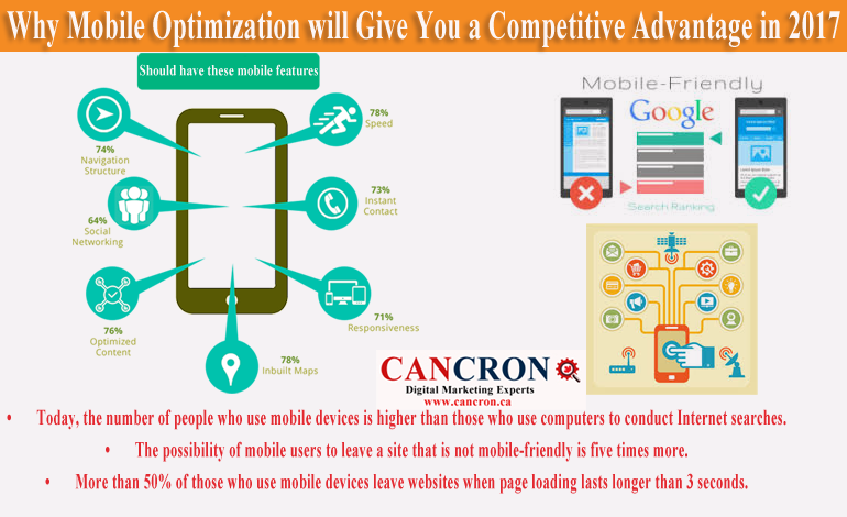
- Today, the number of people who use mobile devices is higher than those who use computers to conduct Internet searches.
- The possibility of mobile users to leave a site that is not mobile-friendly is five times more.
- More than 50% of those who use mobile devices leave websites when page loading lasts longer than 3 seconds.
Since mobile devices have taken over the Internet, more page views are generated by mobile. This means that if your site doesn’t support mobile devices, it will attract an insignificant number of page views. Slow sites similarly turn off mobile users. Mobile data networks are unreliable and therefore, your site should be mobile friendly for you to claim a portion of this lucrative market.
Mobile-First Indices
The mobile-first index explains why desktop-oriented websites will soon be rendered useless. Even though website ranking is still based on a desktop approach, there is likely to be a paradigm shift in coming years. When this comes to pass, links found on your mobile website, its speed, content, and user experience will be the key determinants of your visibility on search engines. Desktop searches will still be relevant but nonetheless, they will take a backseat.
There are several tools that you can use to test the mobile usability of your site. Search Console provides a usability repot, which highlights weaknesses found on your webpages. You should utilize such tools when building new sites, or when optimizing your current website so that it becomes mobile-friendly. Common usability issues include flash usage, non-configured viewports, fixed-width viewports, small font size, and interstitial usage. By optimizing your site, you eliminate these issues. This goes a long way in enhancing users’ browsing experience.
Enhancing Page Speed
Page speed is significant regardless of the device used to access the Internet. It is even more critical when using mobile since mobile users always seek quick answers. Advances such as 4G connectivity have led to speed improvements. Nonetheless, mobile data networks cannot be fully relied upon to deliver the desired speeds.
Google has a PageSpeed guideline, which can enable you to establish how fast your page loads. This will help you pinpoint areas that need to be improved on. Technical improvements that enhance page speed when using mobile devices include the elimination of render-blocking CSS and JavaScript.